Monday, December 6, 2010
The Thumbnails Are In
 |
| Here is my first rough sketch |
And the second. Even though this one is way messier, I like the design for this one better.
Thursday, December 2, 2010
About Bars
I've realized that most of my favorite websites have bars on the top of the screen rather than sidebars. Maybe it's the current trend. Anyway, I like it and I'll be incorporating that into my design.
Tuesday, November 30, 2010
Thoughts
Even though I don't know what my website will be about, I'm thinking it might be something like the Oatmeal's design. It's very clean and bright and I like how the light borders all over the page aren't perfectly straight. That's probably the most inspirational design to me.
Also...
I also like the site design for the webcomic antics (http://www.anticscomic.com/). And it's an awesome comic.
Preferred Website Designs
The website designs that I like are:
- http://www.rush.com/
- http://en.wikipedia.org/wiki/Main_Page
- https://www.newgrounds.com/
- http://cinemassacre.com/
- http://theoatmeal.com/
- The old Youtube design from around 2005(??). Unfortunately it can't really be linked to anymore.
The reason I like many of these designs is mostly because there aren't many advertisements. If there are any, they're not really in the way. Most of them are pretty clean, like Cinemassacre and the Rush website and The Oatmeal (this one being the best example). Other examples like the old Youtube design and Wikipedia do a good job of managing lots of information on one page.
Tuesday, November 16, 2010
Pictures I used for poster
I used pictures like these, along with a couple of other raven pictures in my poster.
At this point, I had a clear view of what I was going to turn my poster into. I knew what it was supposed to look like, just not what it was gong to be about. Keeping in mind that my poster could be an abstract idea, I just decided it would be about ravens, the animals. I suppose if it has an audience anywhere, it would be like at a zoo or something. Or maybe if there were a series of posters promoting a zoo, then my poster would be the one promoting the Ravens :)
Tuesday, November 9, 2010
Change of Mind
I've decided to change my idea away from doing a simple product to doing a poster that is more abstract or less straightforward. Although I will still be looking to my creative matrix to find ideas for the poster
Thumbnail Sketches
Here are the thumbnail sketches. I didn't know what my product was going to be so I cleverly drew a circle to represent my product. Although in the last sketch I had a poster idea if my product was an umbrella. I decided against that one because a) I didn't want my product to be an umbrella. That would be lame and b) That poster would have been far too tricky for me to pull off.
Rather than using the creative matrix to figure out my logo design, I tried to use it to figure out what my poster was going to be about. I was entertaining the fact of doing a movie poster, but i decided i was going to do an advertisement poster for a product or something like that.
Friday, October 29, 2010
Tuesday, October 26, 2010
ANGRY GOOOAAT!!!
I really do like the goat logo. I feel like a company might want to have a simple logo or part of a logo that is easily recognizable, and I feel like the goat is just that. I also like the simplicity of it. It isn't very complicated but I think it's a likeable logo. Also I may rearrange the words to fit around the logo, as per the suggestion of the teacher and other people.
Thumbnail Sketches
And here are my thumbnail sketches. At some point, I wanted to name the business String Theory because it also sounds cool and relates to my business. But I decided in the end to call it Angry Goat because i figured it was more unique and interesting. Mostly I just wanted to incorporate the design of the horns and stuff into the design because they sort of share the universal symbol for metal.
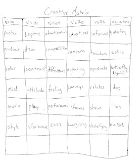
Creative Matrix
Heres my creative matrix. You might be able to able to see the thought process that went into the creation of my fictional business, Angry Goat.
Friday, October 1, 2010
Alternative
As an alternative trace for the Light 7, here is Exclamation 7:
It's a bit ridiculous but I like it anyway.
It's a bit ridiculous but I like it anyway.
Two New 7s
Here's the vectorized version of the depanneur 7:
Aaand here's the vectorized version of the "Light 7":
I personally prefer my Light 7 because it's more unique and personal than the other.
Using light
I decided to use light to make my number 7. I took inspiration from videos like this http://www.youtube.com/watch?v=4SWfPoITlP8.
Using my phone to draw, I tried it many times and the best picture I could come up with was this:
Other failures include:
And just for reference, here's my room where I pulled off this experiment:
Using my phone to draw, I tried it many times and the best picture I could come up with was this:
Other failures include:
And just for reference, here's my room where I pulled off this experiment:
Tuesday, September 28, 2010
Tuesday, September 21, 2010
Tuesday, September 14, 2010
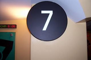
It's pretty hard to find the number 7 outside that isn't part of an address or bus number. Fortunately I work at a movie theatre so I got these simple pictures:
Subscribe to:
Comments (Atom)


