Tuesday, November 30, 2010
Thoughts
Even though I don't know what my website will be about, I'm thinking it might be something like the Oatmeal's design. It's very clean and bright and I like how the light borders all over the page aren't perfectly straight. That's probably the most inspirational design to me.
Also...
I also like the site design for the webcomic antics (http://www.anticscomic.com/). And it's an awesome comic.
Preferred Website Designs
The website designs that I like are:
- http://www.rush.com/
- http://en.wikipedia.org/wiki/Main_Page
- https://www.newgrounds.com/
- http://cinemassacre.com/
- http://theoatmeal.com/
- The old Youtube design from around 2005(??). Unfortunately it can't really be linked to anymore.
The reason I like many of these designs is mostly because there aren't many advertisements. If there are any, they're not really in the way. Most of them are pretty clean, like Cinemassacre and the Rush website and The Oatmeal (this one being the best example). Other examples like the old Youtube design and Wikipedia do a good job of managing lots of information on one page.
Tuesday, November 16, 2010
Pictures I used for poster
I used pictures like these, along with a couple of other raven pictures in my poster.
At this point, I had a clear view of what I was going to turn my poster into. I knew what it was supposed to look like, just not what it was gong to be about. Keeping in mind that my poster could be an abstract idea, I just decided it would be about ravens, the animals. I suppose if it has an audience anywhere, it would be like at a zoo or something. Or maybe if there were a series of posters promoting a zoo, then my poster would be the one promoting the Ravens :)
Tuesday, November 9, 2010
Change of Mind
I've decided to change my idea away from doing a simple product to doing a poster that is more abstract or less straightforward. Although I will still be looking to my creative matrix to find ideas for the poster
Thumbnail Sketches
Here are the thumbnail sketches. I didn't know what my product was going to be so I cleverly drew a circle to represent my product. Although in the last sketch I had a poster idea if my product was an umbrella. I decided against that one because a) I didn't want my product to be an umbrella. That would be lame and b) That poster would have been far too tricky for me to pull off.
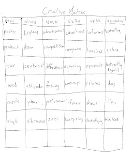
Rather than using the creative matrix to figure out my logo design, I tried to use it to figure out what my poster was going to be about. I was entertaining the fact of doing a movie poster, but i decided i was going to do an advertisement poster for a product or something like that.
Subscribe to:
Comments (Atom)


